Small businesses, established companies, and even those in need of a simple online portfolio should always look for these 5 key features when shopping for a web designer.
Any credible creative agency takes composition very seriously. We pride ourselves on creative layouts which provides ultimate visitor satisfaction.
When visiting a designer’s website, you should be looking for quality and consistency. Compare their business website to their portfolio; is the quality persistent? Their website should manifest a strong ‘first impression’. Take time to browse their portfolio and compare the work ethic on each project.
Does everything line up?
A true web designer cringes when they see a slider off par from the content below. Look for a pleasing, functional layout that should include a nice amount of space, easy to read and an over-all ambiance that is gleaming throughout the website.
Are colours consistent and complimenting?
Each website has a general theme of colour, which if executed correctly, should reflect the client’s branding. The right website will captivate visitors by choosing an appropriate palate. Look for tasteful colour choices that compliment the content and create a healthy user experience.
How many fonts can you count?
Accept that whitespace is a good thing. If you can count more then 3 different fonts, then you’re bound to get confused. Your web designer should maintain a functional flow throughout the website, guiding each visitor along the right path.
Mobile ready?
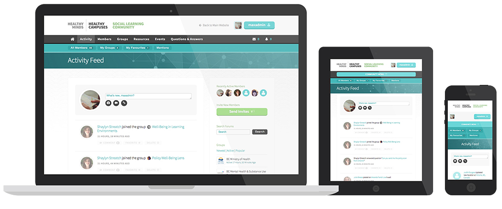
Take the quick mobile responsive test, and grab the bottom corner of you browser’s window and pull towards the top left corner. Begin to shrink the window, until it’s the size of a mobile screen. The website should adapt as you shrink the screen, fitting the size of any mobile device and even tablets.
User Experience
Conclusion
Quality>Quantity.


